PlotDesigner - Cell Properties
The dialog Cell Properties offers multiple tabs to control and to change the properties of the selected cell type. The properties apply to the active cell only. To switch to a different tab, just click on the desired tab.
„General“ tab
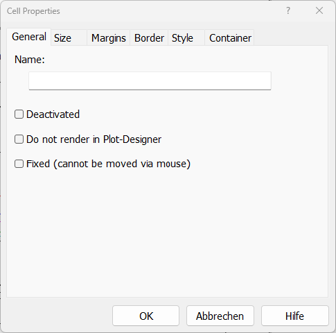
Enter a name for the selected cell which is displayed in the cell tree.
„General“ tab
Deactivated
Deactivating the cell causes the cell and its contents no longer being displayed.
Do not render in Plot-Designer
This option serves to accelerate the screen update since the cell‘s contents are not displayed in this case.
Fixed
A fixed object cannot be moved using the mouse any longer.
„Size“ tab
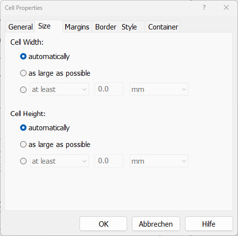
This tab offers to specify both the height (vertical size) and the width (horizontal size) of the cell. Since both, width and height are entered using the same manner, just the input for width is described.
 |
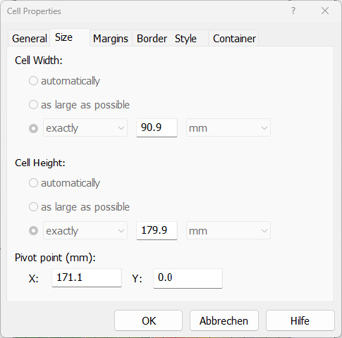 |
| „Size“ tab for cells inside a x, y or z container | „Size“ tab for cells inside a free positionable container |
Cell’s Width/Height
The following options are available for xyz containers:
- automatically: CadnaR automatically calculates an appropriate width of the cell. For text cells, the width is computed from the length of the text to be displayed. For a container, the width is computed from the widths of the cell’s child cells. For an empty cell, this setting corresponds to the behavior with "as large as possible", since it is typically used to fill up unused space.
- as large as possible: The cell is displayed as wide as possible. It fills in the available horizontal space.
- at least/exactly: Type in the width of the cell and select a unit from the drop-down list (in millimeters (mm), in percent % or - with text cells - the number of lines).
- at least: the cell can become larger, depending on the space available
- exactly: The cell‘s size complies with the size specified.
The size’s property (at least, exactly, at most) and the setting „as large as possible“ determine the priority how the space among cells will be shared.
Options „at least/exactly“
When there are just cells having the properties „at least/exactly“ the space for the cell having the property „at least“ will first be arranged first, then for the cell having property „exactly“. Thus, in case there is not sufficient space for all cells, the cell with the setting „at least“ will most likely have the correct dimensions.
The following „units“ are available:
- millimeters (mm)
- percent% of content/parent/sheet
- characters: with text cells
Option „as large as possible“
The setting „as large as possible“ forces the cell to occupy the maximum space. So, with two cells having this property, each will cover 50% of the space available. With only one of two cells having this setting and the other one having the setting „automatically“, then the latter cell will occupy the minimum possible space, depending on the cell type and the properties of the „father“ cell.
Free positionable container
The following options are available for cells inside free positionable containers:
- Width/Height of the cell (in mm), specified by using the mouse or by introducing values manually
- Pivot point X, Y (in mm): Upper left corner of the cell
„Margins“ tab
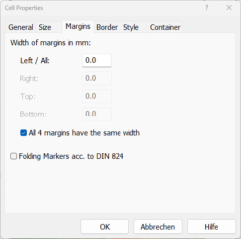
The margins of the white space around the edge of the cell can be defined. Due to margins the cell itself gets smaller. This enables e.g. to indent text in a text cell. Enter a value and select the method used to specify the margins. You may specify a unique margin for all four sides of the cell, or specify different margins for all four sides individually.
Folding Markers accord. to DIN 824
When this option is activated, vertical dashes are printed as folding marks. When no margins are defined the folding marks may be printed onto the axis labeling (see Plan cell).
„Margins“ tab
„Border“ tab
This tab offers to define the cell’s borders (regarding line type, width, and color). If a width of zero is specified, then the border is not drawn. Specify - as described above already - to which borders the settings shall refer to.
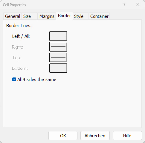
„Border“ tab
„Style“ tab
This tab enables to specify the visual appearance of a page, a container or an individual cell.
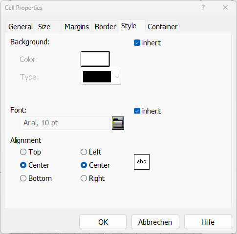
„Style“ tab
Background
Select the background color and the type. Note that for some container cells, the background color will not be visible, as the entire cell will be filled with other cells that have their own background colors.
Font
Selection of font type and size for this cell.
Inherit from „Father“
The heritage rules of cell properties can be defined here. By activating this option, the child cells receive the properties of the father cell. In order not to be urged to change the settings of all child cells, just change those of the father cell and activate this option for all child cells.
Alignment
Select how the cell’s contents are arranged.
- vertical: top, center or bottom
- horizontal: left aligned, centered or right aligned
„Container“ tab
This tab is available for containers only and enables the selection of the arrangement type: horizontally besides each other (in X direction), vertically above each other (in Y direction), stacked on each other (in Z direction) and the free positionable container. With this option, it is possible to change the arrangement type for existing container objects.
consume unused space automatically
This setting is available for horizontal or vertical containers and corresponds to an implicit empty cell at the end of the container without (explicitly) displaying it in the tree. This implicit empty cell is only taken into account if none of the other cells has the dimension "as large as possible" set in the respective container direction.
| Width of all text cells = „automatically“ consume unused space automatically = no 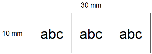 Explanation: For each cell, the required width is calculated in order to display the text abc in the selected font size (approx. 6mm). However, since the total width of the container (30mm) must be filled, each cell is stretched to 10mm. |
| Width of all text cells = „automatically“ consume unused space automatically = yes 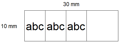 Explanation: Each cell is displayed in the required size (6 mm). The implicit empty cell at the end of the horizontal container „consumes the unused space automatically“. |
| Width of text cells: - First and third text cell „automatically“ - Second text cell „as large as possible consume unused space automatically = yes 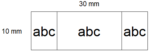 Explanation: Text cell 2 uses as much space as possible. Text cells 1 and 3 are compressed to their required minimum size of 6 mm. The implicit empty cell at the end of the container has no effect, since there is already one cell which is set to „as large as possible“ |
„Text“ tab
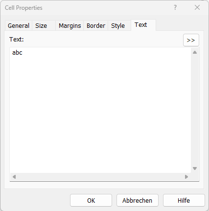
The text cell contains individual text or automatically generated text using keywords (examples see below). By default, the string "abc" is displayed. The text length can be arbitrarily long. Use the RETURN key for word wrapping..
„Text“ tab
Text
Text to be shown by the text cell. Line breaks can be entered with ENTER key. Additionally, keywords can be entered to access project specific values. Keywords can also be used, e.g. #(Table, ...).
Double Arrow (>>)
Gives access to pre-defined text based on keywords.
„Symbol“ tab
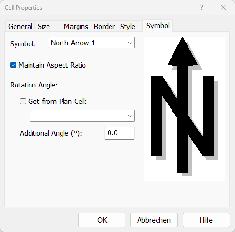
The symbol cell can contain symbols like a North arrow, the grid caption or the symbols available in the library of symbols (see Symbols (2D) and 3D-Symbols).
„Symbol“ tab
List Box „Symbol“
Select one of the symbols provided from the list box (see Symbol).
Maintain Aspect Ratio
If this option is active, then the original aspect ratio of the symbol is kept or adjusted according to the size of the symbol’s polygon. If deactivated, the aspect ratio varies according to the settings on the „Size“ tab.
Rotation Angle/Get from Plan Cell
The symbol cell can adopt an angle of rotation entered for a plan cell. This enables to display e.g. the North arrow with rotated sections correctly (see Section).
Additional Angle (°)
An additional angle will be added to the rotation angle of the section to be printed.
„Bitmap“ tab
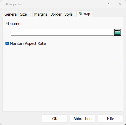
Select a bitmap file about the file selector symbol.
„Bitmap“ tab
The following file formats can be selected:
- Bitmap files (*.bmp)
- JPEG files (*.jpg)
- CMP files (*.cmp)
- PNG files (*.png)
- TIFF files (*.tif)
Option "Maintain Aspect Ratio"
With this option activated the aspect ratio of the bitmap is kept. Otherwise, the aspect ratio is adapted according to the cell's dimensions.
„Caption“ tab
This tab enables to select captions for the grid, the type of land use or objects.
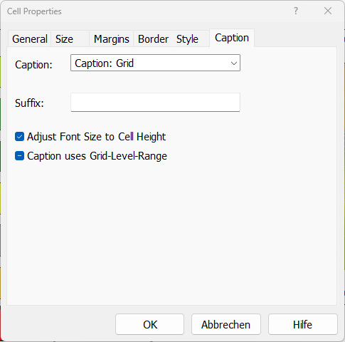
„Caption“ tab
Select the type of caption from this list box. The following options are available:
- Caption: Grid (the caption of the currently selected evaluation parameter)
- Caption: Objects (object types in the project)
- Caption: color palette from the local library (see Color Palettes (local/global))
Suffix
This input determines the unit being displayed at the level values in the grid caption. For example, entering "dB(A)" will cause this text to be displayed behind the level value.
Note
A unit also can be defined in the color palette (see Color Palettes (local/global)). In this case the option "Suffix" is not required.
Option "Adjust Font Size to Cell Height"
If this option is active, the font size is adjusted to the available cell height automatically. When deactivated the selected font size is used, whether the text fits to the cell's size or not.
Option "Caption uses Grid Level Range"
If this option is activated, the value range in the grid's caption depends to the level range defined on dialog Grid|Appearance. This enables to restrict the displayed range of values.
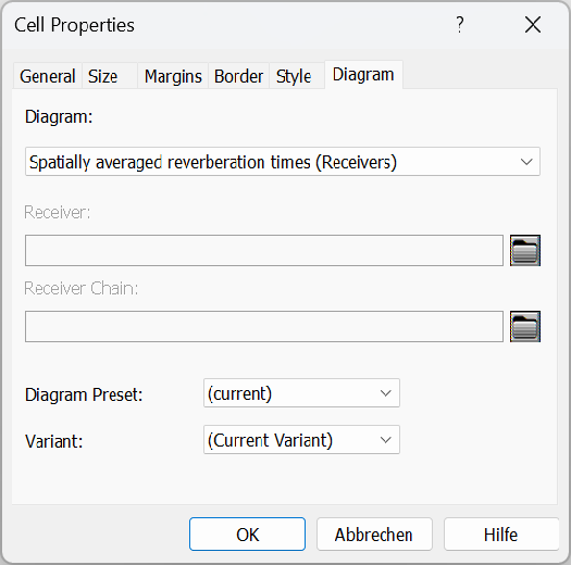
„Diagram“ tab
Diagrams can be displayed with the diagram cell:
„Plan“ tab
Available are e.g. the following diagram types:
- Spatially averaged reverberation times (reveivers), see Spatially averaged reverberation time (Receivers + grid)
- Spatially averaged reverberation times (grid),see Spatially averaged reverberation time (Receivers + grid)
- Spatially averaged level spectra (reveivers),see Spatially averaged level spectra (Receivers)
- Receiver: Reverberation times (object-related)
- Receiver: Level spectrum (object-related)
- Receiver Chain: Reverberation times (object-related)
- Receiver Chain: Level-Diagram (object-related)
- Receiver Chain: STI-Diagram (object-related)
- Receiver Chain: SDC-Diagram (object-related)
Diagram Preset
Select the appropriate Preset for the Diagram representation,see Spatially averaged reverberation time (Receivers + grid) Load Preset,Save Preset (default: current).
Variant
Select the variant to be displayed (default: current variant).
„Plan“ tab
The following options are available for display of plan views:
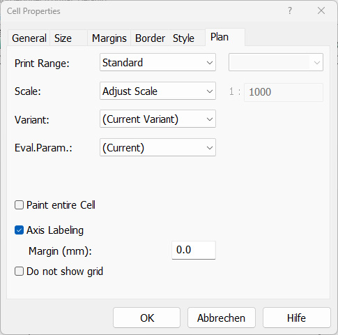
„Plan“ tab
Print Range
The area to be printed is selected here:
- Standard: uses the print range set in „Project“, see Print Graphic and PlotDesigner, Project.
- Limits: The print range shows the whole room.
- Window: The size of the CadnaR main window determines the print range.
- Section: A named section can be selected.
Scale
The scale is selected here:
- Adjust Scale: The scale is adapted to the paper size.
- Adjust Scale (ISO 5455): The scale is adapted to the paper size in defined steps.
- Window: The scale used for print corresponds to the selected scale on the CadnaR main window.
- Direct Input: A scale can be entered (default 1:1000).
Variant
Select the variant to be displayed (default: current variant).
Evaluation Parameter
Select the evaluation parameter to be used (default: currently selected evaluation parameter)
Option "Paint Entire Cell"
This option causes an effect only when the print range "Window" or „Section" has been selected. When activated CadnaR displays more of the graphics than would normally be shown when using the window's or section's real size.
Option "Axis Labeling"
The coordinates on all sides are printed with this option activated.
Note
In case of rotated sections (see Section), the labeling of the coordinate axes is not shown.
Margin (mm)
This value causes a corresponding distance to the coordinate scale (default 11.0 mm).
„3D-View“ tab
The 3D-cell displays the shaded 3D view .
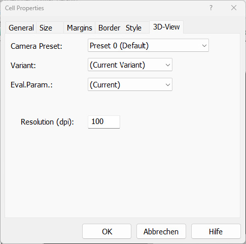
„3D-view“ tab
Camera Preset
Select the camera preset to be displayed. (Default: "Preset 0 (default)" corresponds to the current 3D camera view).
Variant
Select the variant to be shown (default: current variant).
Evaluation Parameter
Select the evaluation parameter to be shown (default: current evaluation parameter)